Saturday, 14 May 2011

Looking back at your preliminary task, what do you feel you have learnt in the progression from it to the full product?

When I look at my preliminary task and then compare it to my music magazine, it has vastly improved along the way.
For instance, when I created my first ever school college magazine as part of my pre-lim task the image was of poor quality and it was badly edited.


As you can see this version of the magazine was not brilliant so I went back and took 3 new pictures and created 3 better magazine covers.
The masthead of  this cover has no colour to it and it is really hard to see, and the coverlines don't really show up on this and the quality is not very good. And when I went back and created the 3 other magazine covers I think the quality improved alot more.


 This magazine front cover is not brilliant but with this masthead you can clearly see it, I manipulated the masthead so that it stood out more on the page.  and the camera shot is a medium shot and the cover doesn't look like a magazine cover much apart from the cover lines and the puff at the top right of the page


This final cover doesn't look like a magazine cover much, the page looks too full of pictures and it's hard to distinguish which one is the main picture and which ones are just cover lines.
The masthead is small on the page and I should've included an exclusive on the page, or the website address.


In these 3 images it was much better quality than my original mock up.
So I think my skills have developed abit more over time, because I’ve been able to recognise where I’ve gone wrong in the past with my magazine covers and been able to correct them.
For all 3 of these images I made the cover girl give me a direct mode of address and the mise en scene of the area is that she looks fitting for our ‘winter’ issue of the school magazine.


I have learnt a lot more about constructing images aswell, I’ve learnt about the different types of camera angles used to make a cover look good and what type of angle to go for when making the artists or cover stars used to look in a particular way, whether you want them to look inferior or superior or if you want them to give a direct mode of address to the audience.
What I have learnt about image manipulation is to be very patient with it, because especially if you do not have a computer which can access a program like Photoshop it can be hard to change photographs around, but I mainly manipulated with the font and font styles, I often had to recolor it to make the white background go away, or make the shadow on the header a lot more bolder, so it would stand out on the page.
What I’ve learnt about designing layouts is, not to make the front cover look too cluttered if there is too much text upon the page then the audience will get bored of reading and move on. But if there is either a balance between image and text or we make the cover lines interesting then it attracts the reader’s attention.
I have learnt that with different types of magazines you of course get different target audiences, with the school/college magazine there was a different target audience of about 16-19 year olds, with little income and who would be interested in things abit more academic so I made my college magazine more focussed on education and the future- Whereas my music magazine had a wider target audience of 16-24 who would be interested in gigs and festivals and who would also have little income so the types of words I used and the things I tried to put across related differently to my different target audiences.

Q6-What have you learnt about technologies from the process of constructing this product?

When I began taking the pictures I realised I did not actually possess an image manipulating programme. So when planning my photo shoot I tried to make the images look as great as possible so there would be no need to manipulate the images- this proved hard for me because some of the images I took looked great but there would be a minor flaw in the image which ruined the whole shot for me so I could no longer use them.I created the front cover, contents page and double page spread all in word, because I found it easy to use and I could add images and texts and also change the shape of some of the images to make it look abit better.

In this image, I took the pictures and changed the shape of it into the shape of a tear drop to make it look a little bit more distorted on the page.


I mainly used word for the creation of my front cover, contents page and double page spread sometimes I found it hard using word to create everything since it’s not really for this particular use.


For the different styles I used either the word fonts which I used on the front page, contents page and double page spread.
These are the font styles I had using words fonts;
-Calibri
-Trebuchet MS


But for the main title of the front cover of the magazine, contents page and double page I used the website dafont.com which offers you free font styles for you to use.

I used these in my magazine.

This is the website dafont.com this is what I used to get my fonts from for my magazine.


These are the font styles I used on the front cover of my magazine; the first font style was an example that was used in my questionnaire so my target audience wanted this font style.
The font style at the bottom has been manipulated; I changed the colour contrast in word to make it stand out against the main image.


Q5-How did you attract/address your audience?

When I made my questionnaire I asked my audience what type of features they would like to see within a music magazine and I got very good responses as to what people would like to see.
My I used features within my magazine that would appeal to my target audience, because my magazine is part of the rock/heavy metal genre I wanted to make me magazine look like that as much as possible, to appeal to my target audience.
On my front cover of my magazine, I used a dark colour scheme to fit into that stereotypical view of a ‘rock magazine’ and the same goes for my double page spread, I stuck with the dark colour scheme in the back ground and made the font colour red to contrast with the black to white background.
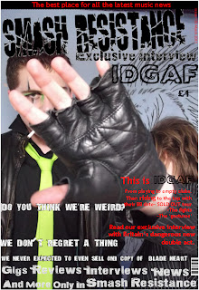
On the front cover of my magazine, I used a lot of pull quotes on the page (the idea came from Q magazine which featured Coldplay on the cover) and these pull quotes link into the feature article which is the double page spread. I also featured key words at the bottom which would entice the reader, “Gigs-Reviews-Interviews-News and more. Only In Smash Resistance” By offering that exclusivity by saying ‘Only in Smash Resistance’ my audience is getting all that they want and need in one place. I also featured an exclusive on the top of the page where it says ‘The Best place for all the latest music news’ once again this is offering my audience all that they need to read about in one place.
The layout of the magazine attracts my audience because the font page of the magazine looks really rocky and fits in with its genre and with the pull quotes around the page it attracts the reader further and makes them want to read it and the contents page attracts the reader because it is a simple layout and design, it features the main cover artists on the front a small box containing the contents and a brief description of each cover line although the magazine will contain other stories and features the main focus- is the artists hence why they are used on the contents page as well.
 The contents page is all about simplicity, people don’t want to read a magazine that looks ‘too busy’ they will get confused on what to read first and where to start, so by using a simple contents page featuring the main artists allows the audience to read this at their own pace and they know that this issue’s main focus is the band ‘IDGAF’


Friday, 13 May 2011

Q4-Who would be the audience for your media product?

The main target audience for my magazine would be males and females between the ages of 16 and 24- I chose this target range because this was the age range I asked in my questionnaire and also because there are some features within my music magazine which would not be suitable for the younger audiences e.g. Censored swearing, the ability to try and buy tickets to festival (they would need a card or bill payers permission) and some of the artists featured would be unsuitable for audiences below this age range.
The social class of my audience would mainly be working class, hence why I made the price of the magazine affordable at £1 for the magazine, and the reason why I chose the age range 16- 24 it’s because I felt that there wasn’t enough magazines within this genre which are for this target audience and I wanted to produce something new and exciting for the gap in the market.

Q3-What kind of media institution might distribute your media product and why?

The Bauer Media group; is a large German publishing company based in Hamburg, which operates in 15 countries worldwide.  And creates 282 magazines worldwide and I think my music magazine would be best distributed by this Media institution because 2 of the magazines that they distribute are Q and Kerrang magazine and they sell millions of copies of these each week because they are extremely popular.
Kerrang magazine especially, is important because they have a similar target audience to my magazine, so the Bauer Media group would distribute it accordingly across the globe.
A unique selling point of my magazine would be the fact that it’s different and it combines lots of different features and conventions to give the audience something new and exciting- but they also have the typical features of a music magazine. If we give the audience too much new in short space of time, then they get put off by it and don’t want to try it.
Bauer would be a great media institution to distribute my magazine because they have such a global market and they are a well trusted name and people can rely upon them and if my magazine was distributed by them, it would mean we would become a household name too and people would respect us.

Q2-How does your media product represent particular social groups?


The social groups I have decided to represent through my music magazine is the social group of the ‘rock/ heavy mental’ group because I felt like there wasn’t enough music magazine for this social group- there’s a lot of indie magazine or pop magazine but only about 2 or 3 proper Rock/heavy metal magazine- so seeing my chance, I decided to plan a rock magazine under the name of ‘Smash Resistance’ to get this name I distributed a questionnaire to 15 people 8 females and 7 males to see what they wanted from a music magazine, and they chose the name Smash Resistance for the name of a music magazine, I also felt the name tied in well with my social group- because I wanted my magazine to be aimed at the rock/metal group I thought the name Smash Resistance would fit in well with that social group.

They will know that the product is aimed at them because they see the front cover of the magazine and that will hopefully attract their attention and they will continue reading the magazine to find out more in the magazine, people who fit into the category of people who like rock/heavy metal will also have other attributes about them, for instance, I expect people who will read this magazine to have a lower income and not be very educated, hence why I kept the text on the contents page and in the double page spread, short, simple and humorous. The price I made my music magazine was £1, I felt that was a comfortable price, because people can always spare a pound for a magazine and it will fit quite well with the people who it is aimed at as it doesn’t hit their pockets too hard.
The themes and issues I have put into my magazine, have been put in there to attract my target audience, for instance, when I distributed my questionnaire I included a question asking them what they would like to see featured in a music magazine and this was my result.

In a music magazine what features would you like to be included in the magazine?
I did a multiple choice question, and I asked people what features they’d like to see, and the most popular were, New upcoming, Band/artist reviews and interviews, world tours/local events. Some of the least popular features were Chart singles and current events- I will consider these aspects when creating my magazine.

So taking this on board, I used their ideas and included these key ideas into my magazine, for instance my main feature is a band interview and I included plenty of the key features that they suggested- the things in this magazine will appeal to them because it was chosen by them.


Evaluation Q1- In what ways does your media product use, develop or challenge forms and conventions of real media products?


My music magazine, used, developed and challenged the typical forms and conventions of real music magazines.
Before beginning to plan my music magazine, I analysed several front covers of magazine’s a double page spread and a contents page of different music magazine’s and my results found that these magazines used different features and conventions to appeal to their specific target audience.


I analysed Kerrang magazine which had Biffy Clyro as the main feature on the cover. In this magazine I really loved the use of colour on the page, red, black and white. With this inspiration I wanted to use the 3 colours on the front cover of my magazine.
Also, I enjoyed the main image on the cover, the way the artists are giving a direct mode of address and how they look quite mysterious, and the tagline fitted in well with the image ‘Unfold the puzzles of life’


I also analysed magazine which featured Coldplay, as the main feature artist on the front cover- what I enjoyed about this magazine was the use of pull quotes around the image which relate to the article, I thought this was a good feature and wanted to use it within my music magazine. The pull quotes, were all interesting quotes which attracted the attention of the reader, I wanted to include the most exciting quotes from my interview to attract my target audience
 I also like the way the title stretched across the page attracting the audience’s attention and keeping us entertained.


 I also analysed NME magazine which featured the indie band Gossip on the front cover of the magazine. I really like this magazine’s use of cover lines around the page because it attracts the attention of the reader. Also I really enjoyed the main image on the cover, the artists are all giving a direct mode of address and it has a great impact up on the viewer of the magazine. Also I like their tagline ‘Sex, Skins and Standing in the way of control’ It really attracts attention and makes you want to find out more about the artist.


What’s similar about my product to these other music magazines is that, I used some of their typical conventions in my magazine, for instance- I wanted to use Kerrang magazine’s colour scheme of black, white and red because the genre of magazine that I am doing is a rock magazine and these 3 colours relate into this genre. The colour Red is the colour of fire and blood, so it is associated with energy, war, danger, strength and power. The colour black is typically associated with power, sophistication and strength. And the colour white is typically associated with innocence and perfection.
So using these 3 colours I had an idea of how my magazine would look.
When I looked at Coldplay’s cover on Q magazine, I really enjoyed the use of pull quotes on the page- these were quotes taken from the Coldplay interview. I wanted to use pull quotes on my magazine, since my double page spread would be an interview with the main artists on the cover of my magazine, I decided to use pull quotes.
  On the right is Q magazine and their use of pull quotes around the picture and on the left is my music magazine and my use of pull quotes on the page.

What is different about my magazine is the main image, is very different to ones I analysed, for instance the magazine’s I analysed all gave a direct mode of address whereas my magazine, is mainly focussed upon a hand which is obstructing the view of the artists- like they don’t want to be seen. But in the back ground you can see one of the artists looking directly into the camera, but it’s the foreground that attracts the attention more, and people who would see this magazine would want to know why the artists do not want them to see their faces.
Also in my main image, the artists are heavily made up, you can only really see one artist’ make up, but that is very heavy and you can’t really see much else of the other artist.
The reason why I wanted to put make up on my artists is because I wanted their image to fit into their genre, which is hybrid of ‘heavy metal and electro’ and the genre of the magazine itself is a rock magazine so I wanted their image to fit into the image I want my magazine to represent.
I chose to develop these certain ideas because when I was planning my ideas for a music magazine, I knew I wanted it to be a rock magazine and I developed my ideas from a questionnaire I got people to fill in for me. So I planned out ideas of what I wanted to do. When I analysed magazine’s which followed the same typical genre, I wanted to use some of their features and conventions, as I said before, I used Kerrang’s colour scheme and Q magazine’s use of pull quotes around the main image- making Coldplay the main focus of the magazine.
Another idea I decided to develop was my double page spread, I analysed Kerrang magazine’s double page spread on My Chemical Romance- which was an interview with the band.
When I was planning my double page spread I knew I wanted my double page spread to be an interview with my artists and I used this Kerrang magazine as a template for my magazine, I included smaller pictures of the band and had a 2 page spread of the interview. But I made my magazine a question and answer session with my artists whereas Kerrang magazine gave background information about the band as well as a small interview with the band, it also had a side banner giving information about new tracks that My Chemical Romance was releasing.

But for my double page spread, I used a basic question and answer session between me (Smash Resistance) and the artist’s (given the name IDGAF)
I gave a short introduction at the top of the pages to introduce the band members and then went straight into the interview, I thought this was the best approach, to let the audience really get to know the band that was being interviewed.
It’s a lot different to the Kerrang issue but I stuck to the similar colour theme and included small pictures of the artist’s featured, just like the Kerrang issue.


For my contents page I followed Kerrang’s issue which featured Bring Me the Horizon on the cover and on the contents page, I analysed this contents page on paper, as I unfortunately cannot find it on the internet.
But I analysed another contents page, from Kerrang and I wanted to follow it’s convention but I felt it didn’t focus much on one specific artist, whereas my contents page, follows the Bring me The Horizon contents page, where it’s just the image of the band and a small box at the bottom containing to contents, I mainly followed my structure upon this concept.


On the left is Kerrang’s contents page featuring My Chemical Romance and on the right, is my contents page for my music magazine- My magazine features the main title and date and issue number and a contents at the bottom which gives a brief description of what’s inside.


Friday, 6 May 2011

A plan of your own music magazine

Layout / structure- For they layout of my magazine, I want the main image to take up the whole page and the coverline’s around the edge of the magazine to be pull quotes and for the magazine to have a tagline at the top of the magazine to make it easily recognisable.

Name of magazine and font for masthead- The name of the magazine I went for was ‘Smash Resistance’ because the name is kinda like a contradiction- because resistance is against something and fighting against something, but to smash it is like breaking the resistance- and I thought it was an ideal name for a Rock genre magazine, because they are always breaking the boundaries in music.
The font for the mast head I used was
I thought the font style for the magazine, was rather good, because the style of it looks like it’s been smashed/broken up so it fits in well with the title of ‘Smash Resistance’.

The main cover line I wanted to use wasRead our exclusive interview with Britain’s dangerous new double act.

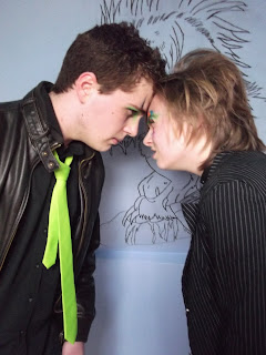
For my magazine I wanted to use 2 people to have a ‘band’ for my magazine, I wanted the artists to be a heavy rock duo with attitude, so for their outfits I gave them leather jackets and for Adam- I dressed him in a black shirt, green tie, leather jacket and jeans. And for Harriet- I dressed her in a blazer jacket, T Shirt and stone washed jeans.
And for both of them, we gave them a heavy make over-
For Adam- We gave him an almost Ziggy Stardust eye make up to give him a more dangerous and rocky look and for Harriet we gave her eccentric colours around her eyes to look like a sunburst.
I let Harriet have an ‘indirect’ mode of address she is looking away from the camera and holding her hand up to the camera and through the gaps in her fingers we can see Adam giving a direct mode of address to the camera, giving eye contact to us- as though he doesn’t fear anything, I also put an unlit cigarette in his mouth, to add to the ‘rocky’ and ‘devil may care’ look.

Features- I wanted the front cover to feature a lot of cover lines so I wanted to use a lot of ‘Pull Quotes’ because my main feature will be an interview with the band, so I want direct quotes from the interview to use on the cover of the magazine.
Positioning of conventional information- I wanted the price to be in the top right corner and for the issue number and date to be right in the top right, and in a smaller font, so people know it’s there but it’s not a main focus point.
Colour Scheme- for the colour scheme, I wanted to keep it simple and since the genre of my magazine is rock and the typical connotations of rock are the colours, black, red and white. So I wanted to use these across my main cover, contents page and double page spread.

Analysis of an existing magazine cover.


On the cover of this magazine, the lighting that is used defines the main characters facial features, the shadows clearly show the creases around his mouth and around his eye- this is to represent the style of music that Coldplay is, the lighting is used to make it look quite dark- so that shows that Coldplay is quite a dark cool band.

The camera angle that is used is a medium close up which is capturing the emotions of the main character we can clearly see that he is looking quite…excited. His facial expression looks like he is eager to get a word in and contribute. Although his eyes are nearly closed he is giving us a direct mode of address to engage with the audience. With his mouth wide open, it looks like he is a quite loud person, with a lot to say- with the added cover lines around the edge, makes it look like he does say a lot.
His face is slightly tilted giving him the impression that he is superior to us and is looking down upon us, and that we should listen to every word he says- because he is important.

The word ‘Coldplay’ is stretched across the page and across his face, looking like he is shouting the word ‘Coldplay’- It is very effective because it starts of small and gets bigger across the page.

The target audience for this magazine would be 16-25 year olds due to the cover lines around the edge of the page, which would appeal to a young target audience. “I lost my virginity 2 years ago.” “We’re not Travis OK?” because young people will be able to relate to these, as well as knowing who ‘Travis’ is.

The layout of the page is very consistent; the colour scheme is a light green yellowy colour- creating a calming effect. The cover lines are all written in the same colour and font style, maintaining regularity.


Planning the photoshoot- I decided to do the iconic Lily Allen and the panther main image from Q magazine and I used my friend to re enact this front cover magazine.
For the scene we used a room which had a white wall and we kept the lights on so to make it seem abit brighter but we kept the flash off the camera. Unfortunatly we didn't have 2 panther's to spare, so we decided to just not include these in the image.
I tried to copy Lily Allen's pose as much as possible so I asked my cover girl to turn and look a certain way.
We tried to match the outfit as much as we could, we got some black leggings and we just used some black short shorts and obviously a top was not necessary for the shoot.
We took about 3 pictures but when we looked at them all we deleted the other 2 and went with this one, as it looked abit more like the original.

Once on the computer I used a software on my laptop called 'Photosuite' and I used that just to alter the background because the original magazine cover, the background is a very light grey, to add dark tones to the image. So I manipulated the image slightly to make the background a light grey/silvery colour.
I then transported the image onto Word 2007- where I added the coverlines and the headings around the image, I recreated the 'Q' Logo- to the best that I could. I stuck to the same colours and similar font styles and sizes for the coverlines and the banner at the bottom.

Looking back on it, I don't think the image itself is terrible but I think it could've done with more work especially on the coverlines- The coverlines were not as bold and close together as the original cover. And without the 2 panther's my version looked a little bit lost, like something was missing from it. If I had a proper image maniuplating program, like photoshop, I might have been able to cut the 2 panthers out of the original magazine and place them on my magazine cover. The main title of 'Lily Allen'- I should've made that stretch across the page and be alot more bolder.But overall I think that the outcome of my recreation of this magazine was satisfactory. But it could've used abit more image manipulation.